Inequality is a hot topic. Prominent economists, such as Thomas Piketty and Joseph Stiglitz, have raised public awareness of economic inequality: differences between people in income (what you earn) and capital (what you own). They and others have shown that economic inequality is not only huge, but steadily increasing: the proverbial "one percent" own more and more of everything there is to own. Others have focused on social inequality, such as differences in the opportunities given to women and ethnic minorities, compared (generally) to white men.
Social and economic inequality are, of course, related; in a sense, economic inequality is a subtype of social inequality. But it's a subtype that is (relatively) easy to quantify—and that's exactly what I will try to do in this post, using data from Eurostat, a public database curated by the European Commission.
We all have some gut feeling of the kinds of inequalities that exist: You probably don't need to see an income distribution to know that, on average, men earn more than women for the same job. But how much more? Do men make 50% more, or only 5%? And how does this compare to differences between people with different levels of education? Or to differences between countries? Or to differences between the very rich and the very poor within a country?
It's important to have some idea of the magnitude of the different kinds of inequalities. Because only then you can have an informed debate.
(Disclaimer: This is my best attempt to interpret complicated data. As you will see below, for example when looking at the gender pay gap, income inequality is not an objective measure, but depends on how you quantify it. So keep that in mind!)
General trends
Let's first simply see how much people earn in a single year, over time in the seven largest countries that are either part of the eurozone (Germany, France, Italy, Spain, and the Netherlands), or are set to become part of it (Romania and Poland).
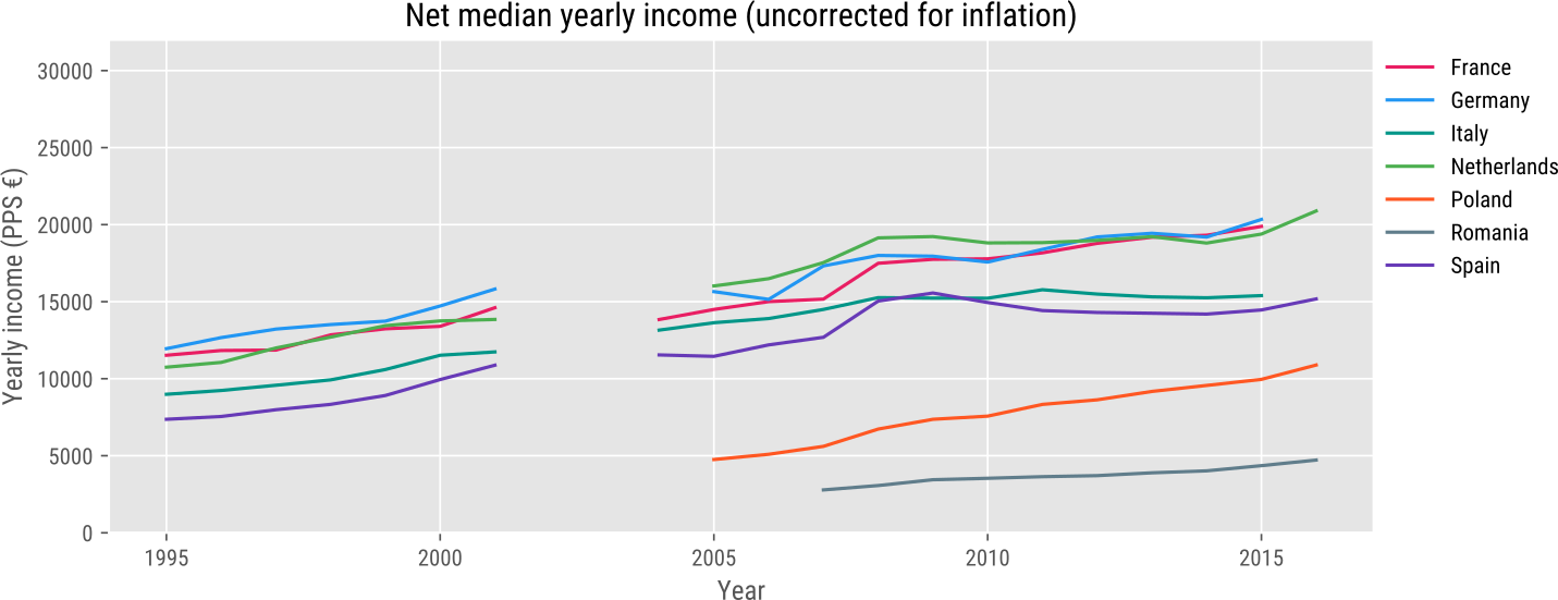
The y-axis shows the median annual income in Purchasing Power Standard (PPS) Euros. This is an artificial currency that corrects for differences in cost of living between countries: Romanians earn far less than Germans. But life is also cheaper in Romania than in Germany, and the PPS tries to take this into account.
So what does this figure tell us? First and foremost, there's an enormous difference in how much people earn across Europe. By and large, people in north-west Europe (represented here by France, Germany, and Netherlands) make the most. People in southern Europe (here Spain and Italy) make somewhat less. And people in eastern Europe (here Romania and Poland) make the least.
These differences are not terribly surprising, although you may be surprised by the size of the income gap between countries: Romanians make only about a fourth of what French people make.
You also see that income has steadily increased over time. But this is largely due to inflation: over time, you can buy less for the same amount of money, but this is generally compensated by a corresponding increase in income.
Correcting for inflation
Therefore, to see whether or not people have become richer (or poorer) over time, we need to correct for inflation. This is what the figure below shows:
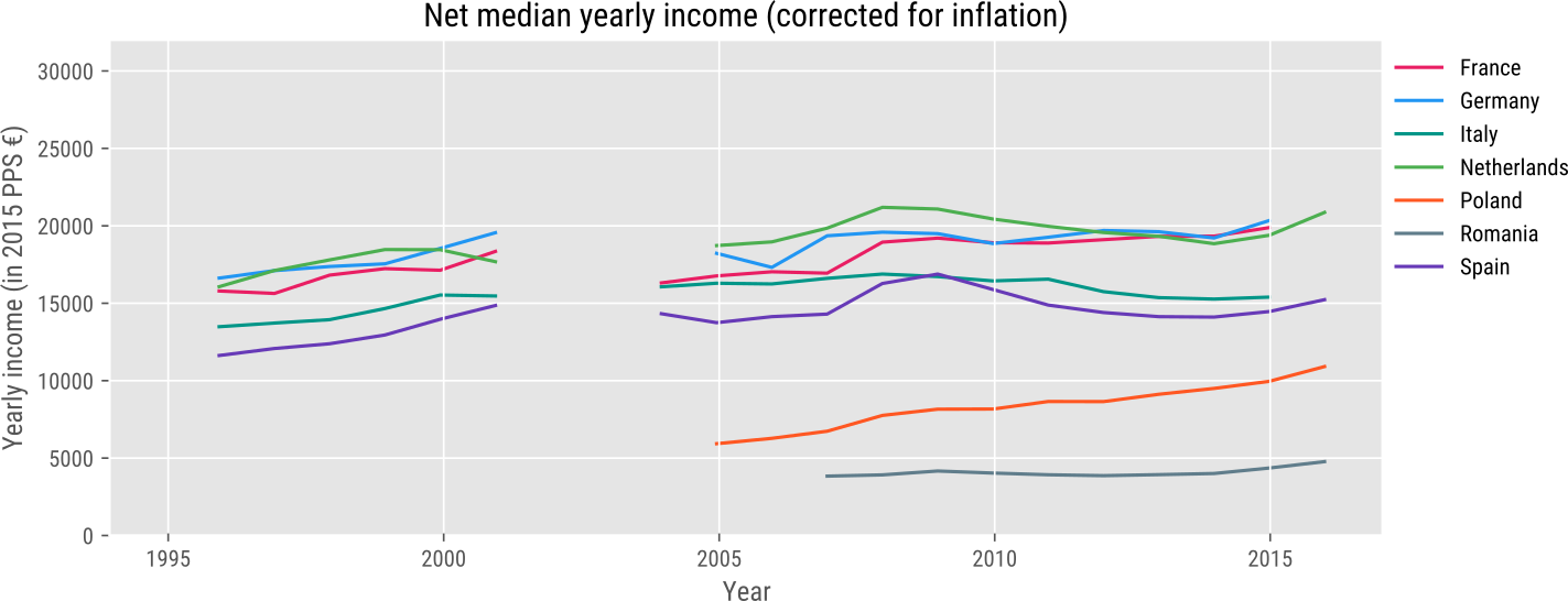
Median inflation-corrected income increased in the 90s, but has stayed more-or-less constant since. It's important to note that we're looking at median income here: 50% of people make more, and 50% make less. If we would look at mean income (the sum of how much everyone makes divided by how many people there are), I suspect we would see a steady increase by most measures; but this is driven by increasing inequality, the fact that a small group of rich people are getting richer, even though the majority of not-so-rich people are not. (On the bright side, the majority are also not getting poorer, which is in contrast to what is happening in the United States, at least according to some authorities.)
Also: comparing wealth over time is, in a sense, impossible. Nowadays we spend a lot of our money on things that did not exist in the 90s, such as iPhones. Therefore, comparing our current wealth with our wealth during the 90s is at best a rough estimate, based on the price of products that are common to both epochs.
The top 10% v the bottom 10%
Let's now take a look at inequalities within countries: how much more do the richest people earn, compared to the poorest people? To illustrate this, I plotted the proportion of total income that goes to the bottom and top 10%.
In a hypothetical perfectly equal country, each would get 10% of the total income (i.e. there would not be any distinction between the rich and poor); in a hypothetical perfectly unequal country, the top 10% would get 100% of all income, and the bottom 10% would get nothing. In reality, the pie is sliced as follows:
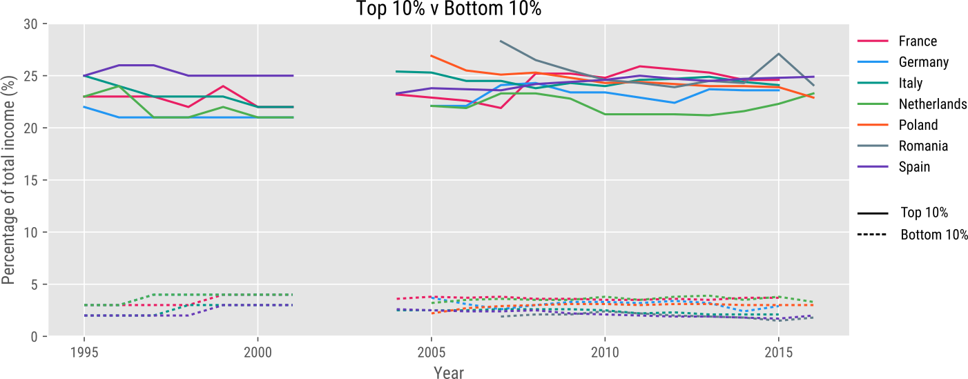
This figure shows that the richest 10% receive about 25% of total income, or 2.5 times their share. The poorest 10% receive about 3% of total income, or only about 0.3 times their share. Phrased differently, the top 10% earn about ten times more than the bottom 10%.
Interestingly, this ratio is roughly equal over time and across countries. The steady increase in inequality that Thomas Piketty documented in his bestselling Le capital au XXIe siècle is not evident in this data. I suspect that this is partly because Piketty looked at more data over a far longer period. But it's also because Piketty considered mostly capital (what people own) whereas this figure shows income (what people earn). And capital is distributed far more unequally than income; for example, rich people tend to own the houses they live in (which are capital, and not income), whereas poor people rarely do.
Gender pay gap
Let's now consider the income gap between men and women:
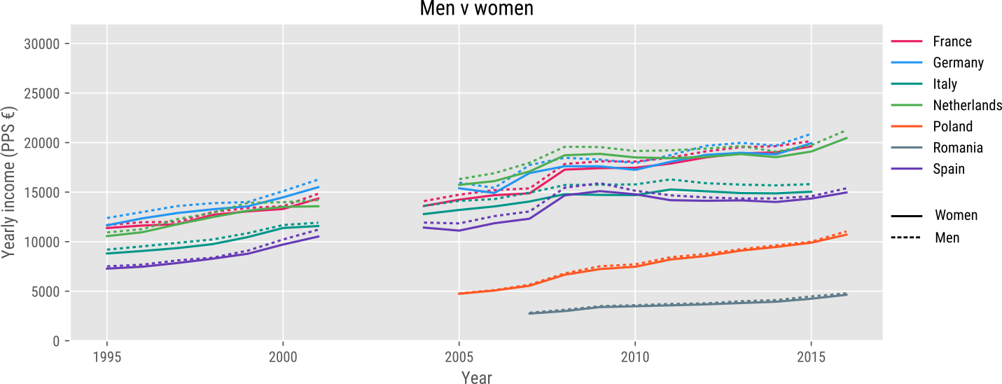
Surprisingly, to me, the income gap between men and women is very small in this data. Men do indeed make somewhat more, but only by 2 to 3%. And this difference is roughly constant over time and across countries.
Eurostat also has a page dedicated to the gender pay gap, and here the gap is reported to be about 16%. So why don't we see this 16% gap in the figure above? I'm not sure, but I suspect that it may again be related to the use of the median or the mean. Top-earning jobs are dominated by men, and this may result in a large pay gap when looking at mean income. But the pay gap may not be as large for normal-paying jobs, which is why there is only a small pay gap when looking at median income. This could be part of the explanation. But I'm honestly not sure.
Education pays
And how about education?
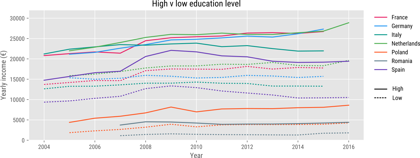
The figure above shows income for people with a low (not more than high school) and high (at least university) education. The income gap is enormous: people with a university diploma make about twice as much as those with only a high-school diploma.
So education pays. Whether it pays so much that it's worth putting yourself tens of thousands of euros in debt for is another matter.