Most things around us are designed; they have been created by other people to serve some purpose. Few things are designed perfectly: Door handles turn the wrong way; chairs are uncomfortable; tables are too high or too low; etcetera. It happens. No-one nor thing is perfect.
But occasionally you come across something that has been designed so poorly that you wonder what, if anything, went through the designer's mind. These are precious gems of stupidity that not only violate principles of good design (which is excusable, because good design is difficult), but seem to have been constructed without any common sense at all.
Here are three random examples of poor design that I came across in the past week.
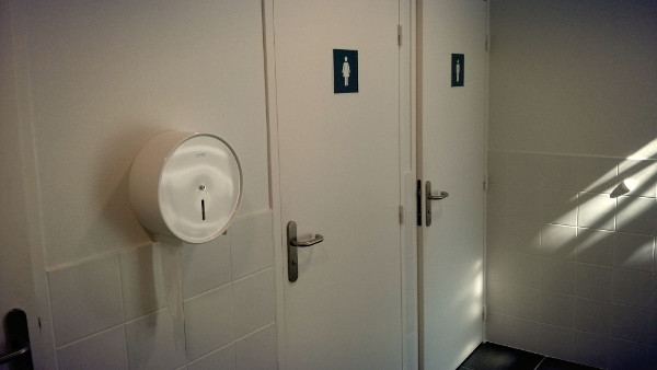
The first is a brand-new bathroom at the University of Lyon II. New and clean bathrooms are rare in France, so coming across a bathroom like this is, in itself, a happy occasion. But do you notice the toilet-paper dispenser? Do you notice where it is? Exactly. (You may be thinking: Surely there are also toilet-paper dispensers inside the actual toilets? There aren't.)
Apparently there was a designer who felt that it was a good idea to put the toilet-paper dispenser outside of the toilets. We can only guess what went through his or her mind, but we can be sure that it wasn't common sense.
I hope there haven't been any casualties yet: People who underestimated before going in. But there will be. Oh yes, there will be.

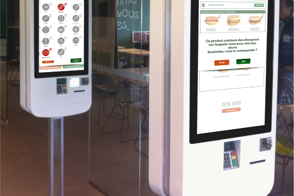
The second example is actually in most ways an example of great design: self-service counters at McDonalds. If you've never used one, here's how they work: You choose what you want to eat and drink using a touch screen and a well-designed selection menu; you pay; you get a ticket with a number; and then you pick up your order at the counter. It's fast and efficient—if you can rely on McDonalds for one thing, it's for selling you as much food as possible, as efficiently as possible. (They actually make a good burger too, nowadays.)
But these self-service counters have a quirk: The PIN device is mounted way down at the bottom, half-buried inside the counter. As a result, if you're standing in front of the counter, the PIN display is hidden from sight. To read it, you have to bend down through your knees, a real back-breaker.
Again, we can only guess why the designers placed the PIN devices so awkwardly on these otherwise so well-crafted self-service counters. The PIN devices seem to have been added as an afterthought (but how can money ever be an afterthought for McDonalds?), as if the designers first made a beautiful self-service counter, then found out that they forgot to leave room for the PIN device, and then just tucked it away at the bottom. (I can just picture the designers talking: "Do you really think it's ok like this? It seems awkward. Maybe we should …" "Naah, it's fine, fuggedaboudit.")

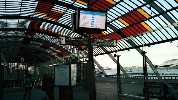
The final example is from the new bus station at Amsterdam Central. It's one of these you-need-to-have-been-there annoyances, but I'll do my best to explain.
A bus station needs at least two things: seats to wait and displays that show the timetable. This bus station has both, so that's good. However, from the waiting seats, you face the timetables sideways so that you cannot read them. Imagine that you're having a staring contest with a rabbit; the timetables are the rabbit's eyes, staring sideways, rather than at you.
So if you're waiting for your bus, you have three options: You sit down and forget about the timetables ("if my bus arrives, I'll notice," but that requires a very zen state of mind); or you stand so that you can keep an eye on the timetables; or you sit down, then stand up to check the timetables, then sit down again, then stand up again, etc. Most people go for the last option. I did.
