Every year, all universities in the world are ranked by academic excellence. (I'm only going to use the term 'academic excellence' once, because every time I write it, I vomit a little in my mouth.) These rankings are created by three self-appointed authorities: QS, The Times of Higher Education, and The Shanghai Rankings.
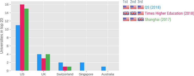
Below you can see where the Top 20 universities come from:

The most striking feature of these rankings is that the Top 20 consists almost entirely of US and UK institutes. In fact, only five countries appear in any of the three Top 20s: US (42×), UK (11×), Switzerland (4×), Singapore (2×), and Australia (1×). And the Top 3 even consists entirely of US (6×) and UK (3×) institutes.
Not all universities are equally good, and I have no problem accepting that Oxford (#6 according to QS) is in all respects a better university than my previous academic home of Aix-Marseille Université (#411-420 according to QS). And universities may, on average and by some measures, be a bit better in one country than another. That's fine.
But the suggestion that, to a good approximation, the US and the UK are the only countries in the world where you can find good universities is ridiculous. What about Japan? What about Germany? What about France—how did Emmanuel Macron become president after receiving an education (well, if you can call it that!) at lowly Paris Nanterre (#801-1000 according to QS)? Compare that to Donald Trump, who was educated at …


